Andrea writes on various topics, such as dating, couples, astrology, weddings, interior design, and gardens. She studied film and writing.
The Perfect Window Seat
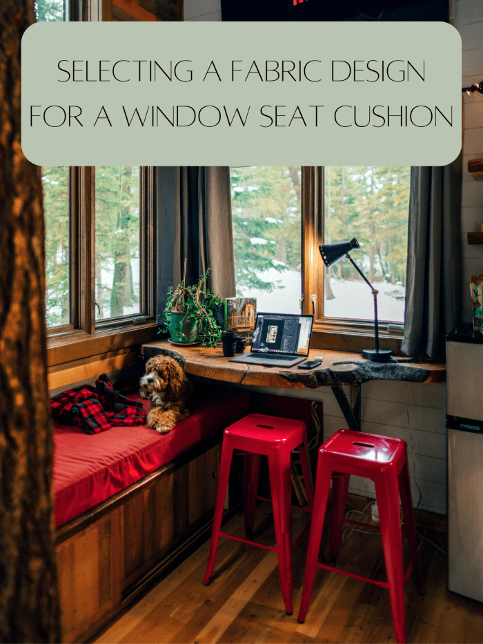
When it comes to a window seat, you want to create a comfy zone with an incredible view of a vista. Window seats are always better when they face something gorgeous, like a rose garden, beach, or orchard. Your window seat is the gateway between your indoor and outdoor havens. The fabric design you pick for your window seat cushion’s slipcover can either bring your room together or make for an eyesore.
This article will help you navigate a challenging interior design space. I’ll give you an idea of what colors go well together and what to avoid. I’ve also included a video on how you can make your own box corner cushion for a window seat.
A Calm Vibe Is Appropriate for a Window Seat
The window seat nook is a perfect spot for reading and relaxing, so it’s a good idea to select colors that are calming. Window seats often have storage underneath or shelves for books and trinkets, so it’s a utilitarian space. Why am I mentioning that it’s a utilitarian space? Because I think you should pick a universally appealing color rather than one that’s polarizing, like neon orange.
Some of my favorite colors for window seats are blue, white, gray, and seafoam green. These colors are calming and easy to work with.
When it comes to selecting the right fabric for your window seat cushion’s slipcover, it’s important to consider the look of your room. A window seat is a large area, and you want to make sure the look of your padding and pillows fits with the aesthetics of your room.
Since a window seat is already an eye-grabbing feature of a room, you don’t really need to have bold fabric or extravagant pillows for the spot. My recommendation before looking at any fabric designs is to figure out a color scheme for the room. This will allow you to narrow your criteria for fabric designs.
My other suggestions that I’ll be going over in this article include:
- Selecting a pattern that’s easy to match with pillows
- Why working with sample fabrics is a smart idea
- Considerations for pet owners
Working With Colors
Color cohesion is one of the most important parts of interior design. If you know how to use the color wheel to your advantage, selecting the right pieces for your home will be a breeze.
Why is color so important when it comes to your rooms? Color is a form of non-verbal communication that can radically influence your mood. Picture it this way: A room with neon green paint is going to make you feel energized in a way that a soft gray room won’t. Picking the right color scheme will have a positive influence on the comfort level of a space. A room with clashy colors will make people feel agitated.
Color is part of your room’s story; it sends a message about what kind of activities take place in the room.

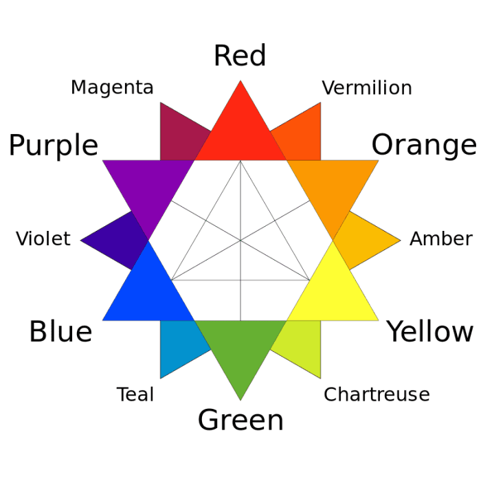
The RYB color wheel. The primary colors are red, yellow, and blue. Combining primary colors creates purple, orange, and green. Combining primary and secondary colors creates magenta, vermillion, amber, chartreuse, teal, and violet.
Some colors clash horribly together, while others are kismet. So how can you know what colors work and which ones don’t?
Scroll to Continue
First, the three primary colors are red, yellow, and blue. We combine red, yellow, and blue in different ways to create new colors. Red and yellow make orange, red and blue make purple, and yellow and blue make green. The secondary colors are the ones created by the primary colors. Tertiary colors are the six shades made up of secondary and primary colors:
- Violet: blue and purple
- Magenta: purple and red
- Vermillion: red and orange
- Amber: orange and yellow
- Chartreuse: yellow and green
- Teal: green and blue
Color Schemes
There are several color schemes that can be created using the color wheel. I’ve listed the most common ones below.
Analogous Color Scheme
An analogous color scheme uses three colors that are side by side on the color wheel. For instance, red, vermillion, and orange sit next to each other. They will go well together for a room’s color scheme.
Proportions will help make a room feel balanced when using an analogous color scheme. Designers recommend for this color scheme to use the following proportions: 60%, 30%, and 10%.
Here is how you can break up those numbers:
- Dominant, 60% of one color: walls, accent pieces, carpet, rugs, and couches.
- Supporting, 30% of one color: curtains, side chairs, shelves, accessories, and lamps.
- Accent, 10% of one color: cushions, patterned fabrics, decorations, and artwork.
The dominant color you use should be a primary or secondary color. The supporting color should be a secondary or tertiary color. The accent color should be a mix of the dominant and supporting color, or a color that pops.
My recommendation when selecting fabric for a window seat, if you’re doing an analogous color scheme, is to veer toward your supporting or accent color. A larger window seat might fair better with your supporting color, a smaller window seat might fair better with your accent color.
If you like neutral colors for the overall color scheme of a space, you can use the analogous color scheme just for your accents. Consider a room that’s mostly white, but you add pillows, curtains, and fabrics in analogous colors.
Complementary Color Scheme
The complementary color scheme is one of the simplest to use. It plays off two colors that are on opposite ends of the color wheel. Here are the typical complementary color schemes:
- Red and green
- Blue and orange
- Yellow and purple
For the most part, one color will act as the dominant shade in the room. The other color will act as an accent. The colors have high contrast with each other, so you need to be careful about how much you use them. The color you want to use as an accent will look better if you balance it with a neutral. In fact, your accent might look better if it’s used as a pattern instead of a solid color.
I recommend if you’re using a complementary color scheme for a room with a window seat that your cushions and/or padding are in the accent color. Here are some other suggestions for this scheme:
- It’s a good idea to mix neutrals in a room with complementary colors so the room doesn’t look too intense.
- You could also focus on a neutral room that’s mostly beige but has complementary color accents.
Monochromatic Color Scheme
A monochromatic color scheme uses tints, tones, and shades within the same hue or color family.
- Adding white to a pure color creates tints.
- Adding black and white to a color creates tones.
- Adding black to a color creates shades.
A monochromatic color scheme focuses on a hue and its gradients. You’ll be playing with light and dark variations of a single color.
Unity is the benefit of a monochromatic color scheme. Everything will feel like it fits together, and there is no risk of clashing. The problem: it could make your room look bland.
The best way to work with a monochromatic color scheme is to add patterns and prints. This will help add dimension and variety to the room, giving your eyes something fun to explore.
Color Tips
Interior design isn’t rigid when it comes to color rules. You can stretch and break rules to get the feel you want. I like contrasting colors that aren’t complete opposites on the color wheel. I think this makes for a softer effect.
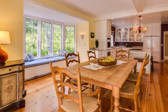
Keep in mind: Accents tie rooms together. A window seat’s cushion and pillows will likely be your accent unless you have a monstrous-sized window seat. Your room will look better if you pick a color for your window seat that’s different from the walls.
Accent colors can also connect different rooms together, so you may want to consider using the dominant color of another nearby room for your window seat. Using a trick like this can help you balance and unify your home.
If your room is small, light colors will help to make the room feel bigger. Darker colors are better suited for big rooms. In case you’re not sure what is considered small or big for rooms, I’ve included a link to common room dimensions.
Selecting a Pattern That’s Easy to Match With Pillows
You can find fabrics in several places whether Wayfair, Etsy, or Jo-Anns. You may want a single cushion for your window seat and no pillows. You might want to go the opposite route and have a plethora of pillows and a crate to store your extra pillows.
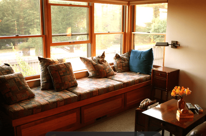
My recommendation is simple: If you have a solid-colored window seat cushion, you can add more pillows with patterns, and if you have a patterned window seat cushion, you’ll want to rely more on solid-colored pillows.
You can, of course, mix and match with solid-colored and patterned cushions, pillows, and blankets. You don’t want your window seat’s pillows to look busy or unorganized.
Here are some of my top tips for selecting patterns:
- Stick to a theme for the room, and it will make it easier to make decisions for furnishings and decorations.
- A pattern that is elegant and repeats itself will be easier to match to other items than something that has a chaotic pattern. I recommend for a window seat that you pick a color or pattern that’s elegant. If you’re designing a window seat for a child’s room, you can embrace wackier colors and patterns.
- A window seat with a cushion of unicorns dancing on cupcakes with pillows in every color of the rainbow might seem unusual for a living room. People will assume that you have a child.
- Avoid patterns that have to do with pop culture, sports teams, TV shows, and logos. This will seem really gauche. You want to select a pattern that’s meant to be a pattern, not something that looks like an advertisement.
- Pillows are great for window seat areas because they can add texture and dimension. When everything is a solid color and has no texture, it can come off boring. Different textures help bring life into a room.
- Overall, it’s easy to match pillows to a window seat cushion that’s solid-colored. If you want a patterned window seat cushion, I recommend picking solid-colored pillows that have the colors used in the window seat cushion.
Why You Should Sample Fabrics
If you’re planning to buy fabric online, I highly recommended getting samples from a few different places. You need to see what something looks like in person rather than in pictures. It will also give you an idea of what the quality of the material is like and if it’s something you want for a long time.
I recommend getting a few different samples and comparing them to your wall color. You may find that when you have samples before you that one pattern that seemed just okay has new life when next to your pink walls.
With a sample, you may also find that the material is hard to work with and would be a pain to cut, sew, add a zipper, and stuff with padding. You want something that’s soft and easy to clean, not something that’s scratchy and annoying.
When you buy the real deal, buy more than you need in case there is an accident. You want fabric from the same printing process because dyes can subtly change. Buying the material all at once guarantees consistency of color. Ordering more material later could result in noticeable color differences.
Fabrics and Pets
Pets and children can ruin a fabric. It’s not uncommon for a cat to pee in the wrong place. A new puppy could tear up your pillows in a matter of seconds. For window seat cushions and slipcovers, I recommend using a material that’s durable, easy to clean, and won’t lock in bad odors permanently.
Polyurethane Laminate (PUL) fabric is highly recommended for those who own pets. It is a soft, flexible, hardwearing, and waterproof fabric. People often use this material for homemade and reusable diapers, so there are some very unusual patterns available.
PUL fabric is designed to withstand cycles in your washer and dryer. This means if your kitty has an accident on the fabric, you can throw it into your washing machine and dryer and not be left with a tattered mess. PUL fabric is ideal for pet owners, and it can be found online. It might be trickier to find it at in-person stores.
When buying fabric for your window seat cushion, it doesn’t necessarily have to be PUL fabric in order to withstand the elements. Read descriptions for fabrics carefully. If it says it’s waterproof and can withstand several conditions, then it probably is a good fit for your window seat pad.
This content is accurate and true to the best of the author’s knowledge and is not meant to substitute for formal and individualized advice from a qualified professional.
© 2022 Andrea Lawrence
link


